Y Garreg
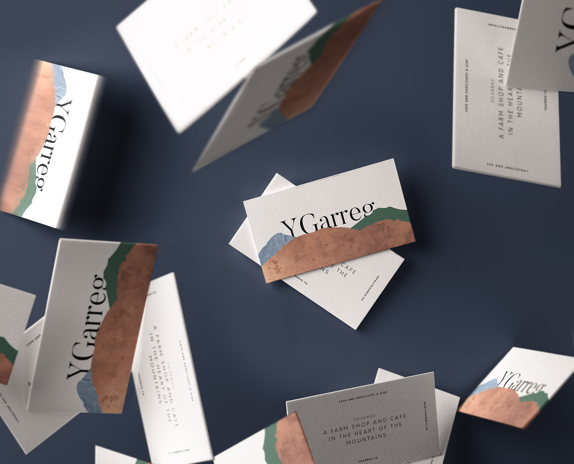
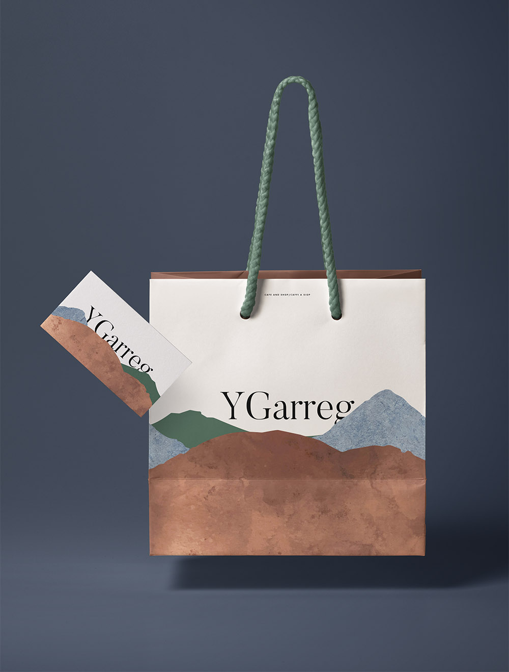
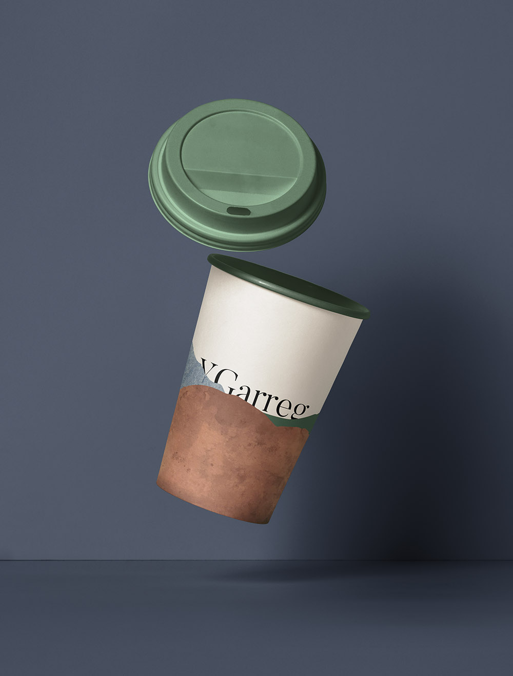
Y Garreg is a new Cafe & shop nestled in the picturesque region of Llanfrothen in Northern Wales. Y Garreg translates as ‘The Stone’, and the identity takes it’s visual cues from the striking surrounding landcsape. It borrows it’s palette from raw materials found in the region and champions local mountains and land-marks.
Branding, Identity, Interior

A selection of logo lock-ups, stamps, monograms and illustrations were developed
Adding depth to the brand
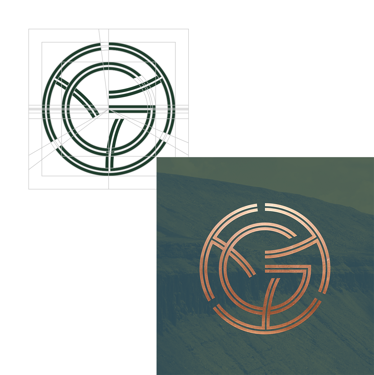
Primary Brand Marque
The logo combines the letters Y & G into a circular design inspired by traditional Celtic knot patterns. The logo forms part of a larger suite of marques designed to be layered and combined.
Primary Logotype
The full logo lockup combines the Primary Brand Marque with the name & subheading set in contrasting yet classic typefaces.
![]()
![]()
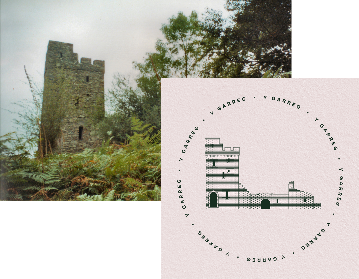
Inspired by the Area
Brondanw Tower, a long-standing monument in Llanfrothen is used as a brand illustration to anchor Y Garreg to it’s surroundings.

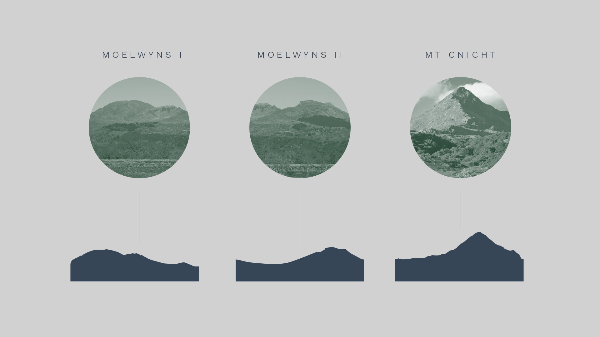
Making the scenery the hero
The mountains of Llanfrothen are the centre point of the brand identity